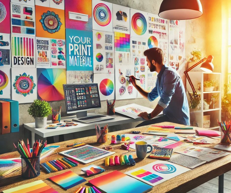
When you’re designing print materials, you want them to grab attention and convey your message effectively. It starts with bold colours that not only catch the eye but also reflect the emotion behind your brand. From there, you’ll need to consider typography that enhances your message while maintaining consistency. But that’s just the tip of the iceberg—there are several key elements that can elevate your designs to the next level. Let’s explore how these components can transform your print materials into something truly memorable.
Choose Bold Colours
When you design print materials, bold colours can make a striking first impression. They grab attention and convey a sense of energy and excitement.
To effectively use bold colours, start by choosing a limited palette that complements your brand. Too many colours can overwhelm your audience, so aim for two to three main hues.
Consider colour psychology; for instance, red evokes passion while blue conveys trust. Make sure the colours contrast well with each other and the text, ensuring readability.
Test your designs both digitally and in print, as colours may appear differently. Finally, remember to maintain consistency across all your materials to strengthen your brand identity.
Embrace bold colours, and watch your designs come to life!
Use Eye-Catching Typography
Bold colours grab attention, but eye-catching typography can elevate your print materials even further. Choose fonts that reflect your brand’s personality—whether it’s modern, classic, or playful.
Don’t shy away from mixing fonts, but limit yourself to two or three to maintain consistency. Make sure your headlines stand out with larger sizes or bold weights, creating a clear hierarchy.
Pay attention to spacing; proper kerning and line height can significantly enhance readability. Experiment with colour contrasts to ensure your text pops against the background.
Finally, avoid overly ornate fonts that might confuse readers. Remember, your typography shouldn’t only attract attention but also communicate your message effectively. Make each word count and keep your audience engaged from start to finish.
Incorporate High-Quality Images
High-quality images consistently elevate print materials, making them more visually appealing and engaging. When you incorporate striking visuals, you grab your audience’s attention and convey your message more effectively.
Choose images that align with your brand and resonate with your target audience. Avoid pixelated or generic stock photos; instead, opt for original photography or high-resolution images that showcase your products or services.
Remember to consider the colour scheme and overall theme of your design, ensuring that images complement the text rather than clash with it. A well-placed, high-quality image can create a focal point, guiding the viewer’s eye and enhancing the overall impact of your print materials.
Prioritize quality, and your print materials will stand out from the competition.
Design for Layout and Space
Effective design hinges on the careful consideration of layout and space. You want your print materials to be visually appealing and easy to navigate, so pay attention to how elements are arranged.
Start by establishing a clear hierarchy—make sure your most important information stands out, using size and colour effectively. Don’t overcrowd your design; give each element room to breathe.
Use white space strategically to guide the reader’s eye and enhance comprehension. Consider the flow of your content; it should lead the reader naturally from one section to the next.
Balance visuals and text to create an engaging layout. Remember, a well-structured design not only captures attention but also communicates your message effectively.
Add Unique Finishing Touches
To elevate your print materials, consider adding unique finishing touches that leave a lasting impression. Techniques like embossing or debossing create a tactile experience that draws attention.
Use spot UV coating to enhance specific areas, giving your design a glossy finish that contrasts beautifully with matte elements. Metallic foils can add a touch of elegance, making your materials stand out even more.
Don’t forget about die-cutting; it allows you to create custom shapes that capture interest. You might also explore textured paper, which adds depth and character.
Lastly, consider unique binding options for brochures or booklets—this can transform a simple print piece into a memorable keepsake. These finishing touches can truly make your print materials pop!
Frequently Asked Questions
What File Formats Are Best for Print Materials?
For print materials, you’ll want to use file formats like PDF, TIFF, and EPS.
These formats ensure high-quality resolution and colour fidelity, making your designs crisp and vibrant when printed.
Avoid using low-resolution formats.
How Do I Choose the Right Paper Type?
When choosing the right paper type, consider your project’s purpose and audience.
Think about texture, weight, and finish. Glossy paper suits vibrant images, while matte’s ideal for readability.
Test samples to see what fits best.
What Is the Ideal Resolution for Print Images?
The ideal resolution for print images is typically 300 DPI.
This ensures your images look sharp and professional.
If you use lower resolutions, your prints may appear pixelated or blurry, impacting overall quality.
How Can I Create a Cohesive Brand Identity?
To create a cohesive brand identity, you should establish consistent colours, fonts, and imagery.
Align your messaging across all platforms, ensuring each piece reflects your brand’s personality and values.
Consistency builds recognition and trust.
What Printing Techniques Can Enhance My Designs?
You can enhance your designs with techniques like embossing for texture, spot UV for gloss highlights, and foil stamping for metallic effects.
Experimenting with these methods adds depth and visual interest to your printed materials.
Incorporating these five tips will help your print materials truly pop and grab attention. By choosing bold colours, eye-catching typography, and high-quality images, you create a strong visual impact. Don’t forget to design with layout and space in mind for clarity, and add unique finishing touches to elevate the experience. With these strategies, your materials won’t just stand out—they’ll leave a lasting impression on your audience. So go ahead and make your designs unforgettable!