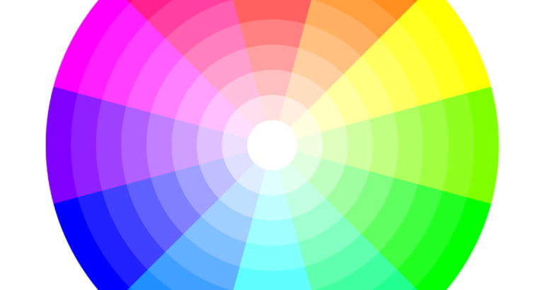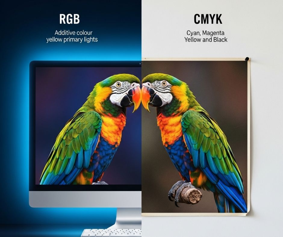
You have spent weeks perfecting your new leaflet. The colours on your screen are vibrant. They pop with energy. You send the file for printing, buzzing with excitement. But when the box arrives, your heart sinks a little. The colours look… different. They seem flatter. The punchy orange is now a bit muted. The deep blue is not quite as rich. Why did this happen?
It is a common story. The problem is not your design or our printers. The issue lies in two different colour languages. Your computer screen speaks one language. A printing press speaks another. Understanding this difference is the key to perfect prints. It helps you get exactly what you envision.
The Glow of the Screen: Understanding RGB
Every screen you look at uses the RGB colour model. This applies to your computer, phone, and television. RGB stands for Red, Green, and Blue. It is an additive colour process. Think of it like mixing coloured lights in a dark room. You start with blackness (no light). You add red, green, and blue light in various amounts. This creates a wide spectrum of colours. When all three are at full intensity, they create pure white light.
This system is brilliant for devices that emit light. Screens create colour by shining light through pixels. But you cannot print with light. Paper does not glow in the dark. That is why a design created in RGB can look so different on paper. The bright, luminous colours are impossible to replicate with ink. The translation from light to pigment causes a colour shift.
The Art of Ink: Meeting CMYK
Professional printing uses the CMYK colour model. The letters stand for Cyan, Magenta, Yellow, and Key. ‘Key’ is the technical term for black. Unlike RGB, CMYK is a subtractive process. You start with a bright white surface, which is the paper. You then add inks to subtract or absorb light. As light hits the ink, some colours are absorbed. We see the colours that are reflected.
Think about mixing paints in primary school. The more paint you added, the darker it became. CMYK works similarly. Combining cyan, magenta, and yellow ink should create black. In reality, it produces a muddy dark brown. That is why we have a separate, true black ink (K). It provides real depth and crispness for text and dark areas. Every professional print job uses this four-colour process.
From Screen to Stunning Print
So, how do you bridge this gap? How do you get your printed materials to match your vision? Thankfully, the process is straightforward with a little preparation. You can get the colours you want every time.
First, always set up your design files in CMYK mode. Do this from the very beginning of your project. Converting a file from RGB to CMYK at the last minute can cause big colour changes. Most design software has a simple option for this. Starting in CMYK gives you a more realistic view of the final colours.
For absolute brand consistency, consider Pantone (PMS) colours. These are standardised, pre-mixed inks. They produce an exact colour match every single time. If your logo has a specific shade of red, Pantone printing is the answer. Finally, always ask for a printed proof. Seeing a physical sample is the best way to check colours. It lets you approve everything before the full run. This simple step saves both time and disappointment.