Driving through a busy Surrey street is a fast experience. Shops fly past in a blur of glass and brick. Most business owners want to grab a piece of that attention. You have roughly three seconds to make an impression. If your sign is boring, you lose the lead. Think of your pavement sign as a bold shout in a quiet room. It must be loud enough to hear. It must be clear enough to understand. Effective outdoor signs act as silent street performers for your brand. They grab the eye and point the way to your door. Do not let your business stay a secret.
Less is Definitely More
Drivers do not have time to read a menu at thirty miles per hour. You must boil your message down to the essentials. Use five words or fewer for the best impact. “Half Price Pizza” is a clear and fast winner. “Quick Car Wash” tells a story in an instant. Do not clutter the board with your phone number or email. People will not stop their cars to write them down. A single, bold headline works wonders for your footfall. It is like a quick wink from across the road. Keep it simple and keep it punchy.
I once saw a sign with a long list of services. It looked like a giant wall of text. No one stopped to read it. The shop next door just had a giant arrow and the word “Cakes”. That shop had a queue out of the door. People react to clear signals. They do not want to work hard to find you. Give them the answer before they ask the question. Your sign should be the start of a conversation. It should not be the whole book. Use big letters that stand out.
High Contrast and Bold Choices
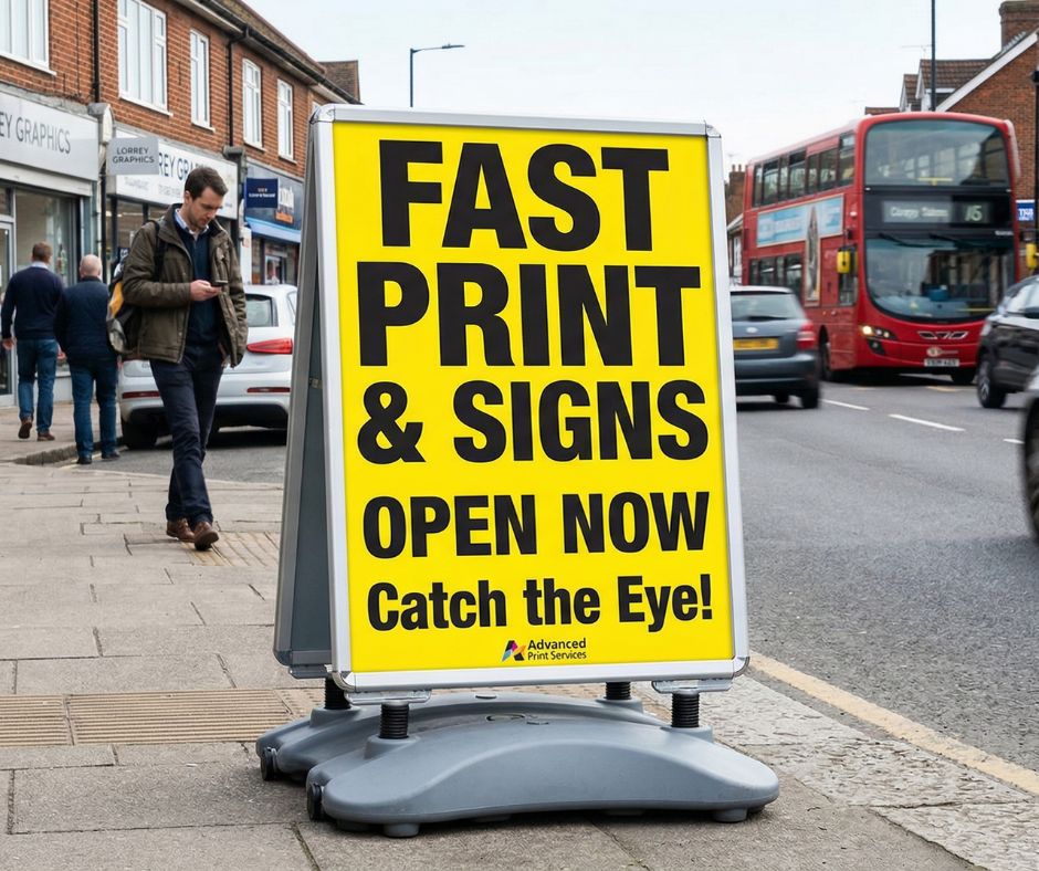
Your sign competes with the grey pavement and dark walls. Use colours that jump out and grab the viewer. Black text on a yellow background is a classic choice for a reason. It offers the highest contrast for the human eye. Avoid using pale pastels or thin fonts for your main message. These disappear when the sun goes down or the rain starts. Your sign should look like a bright spark on a dull day. Contrast is your best friend when you want to reach people.
Think about the font you use. A fancy script might look pretty in a wedding invite. It is a nightmare to read from a moving car. Use a strong and heavy typeface instead. Make sure the letters have space to breathe. If the characters touch, they become a smudge at high speeds. I tell my clients to test their signs from a distance. Walk fifty yards away and turn around fast. Can you still read the offer? If the answer is no, you need to simplify. A clear sign is a profitable sign.
Location and Staying Power
Place your sign where it meets the eye line of the driver. Angle it slightly to face the oncoming traffic flow. You must also think about the safety of pedestrians on the path. Nobody likes to trip over a stray board on their way to work. Check the local rules for your part of Surrey to avoid fines. A heavy base is a smart purchase for our windy British weather. You do not want your marketing flying down the high street like a kite.
Keep the board clean and free from dirt or scuffs. A dirty sign suggests a messy business inside. Show the world that you take pride in your work. Change your message often to keep things fresh for locals. If people see the same board every day, they stop looking. A new joke or a daily special keeps them curious. You want to be the talk of the town. A well-placed sign is worth its weight in gold. It brings people in when everything else is a blur. Take the lead and own the pavement today.